

Valoración del libro
Parámetros
- 271 páginas
- 10 horas de lectura
Más información sobre el libro
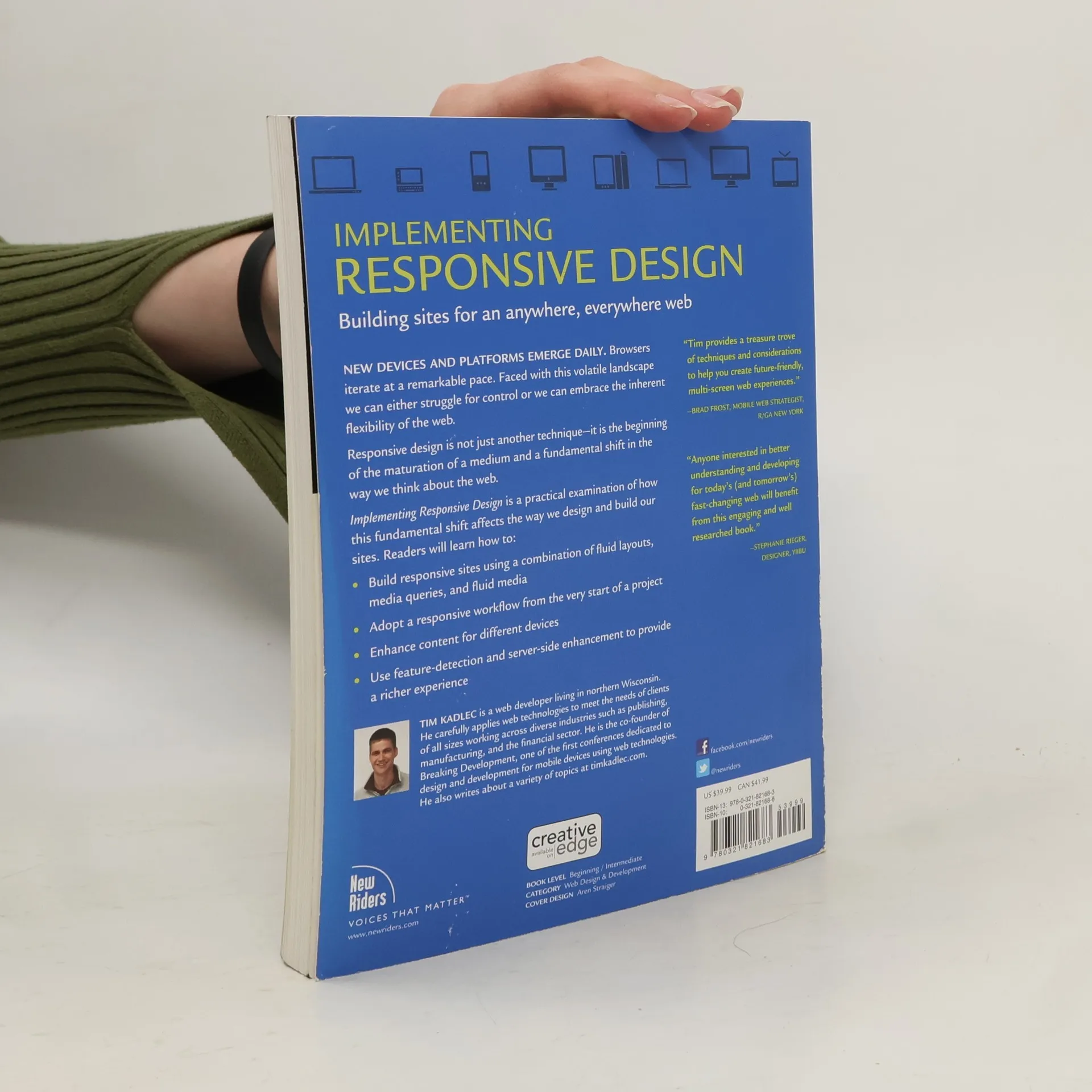
New devices and platforms emerge daily. Browsers iterate at a remarkable pace. Faced with this volatile landscape we can either struggle for control or we can embrace the inherent flexibility of the web. Responsive design is not just another technique-it is the beginning of the maturation of a medium and a fundamental shift in the way we think about the web. Implementing Responsive Design is a practical examination of how this fundamental shift affects the way we design and build our sites. Readers will learn how to: Build responsive sites using a combination of fluid layouts, media queries, and fluid media Adopt a responsive workflow from the very start of a project Enhance content for different devices Use feature-detection and server-side enhancement to provide a richer experience
Compra de libros
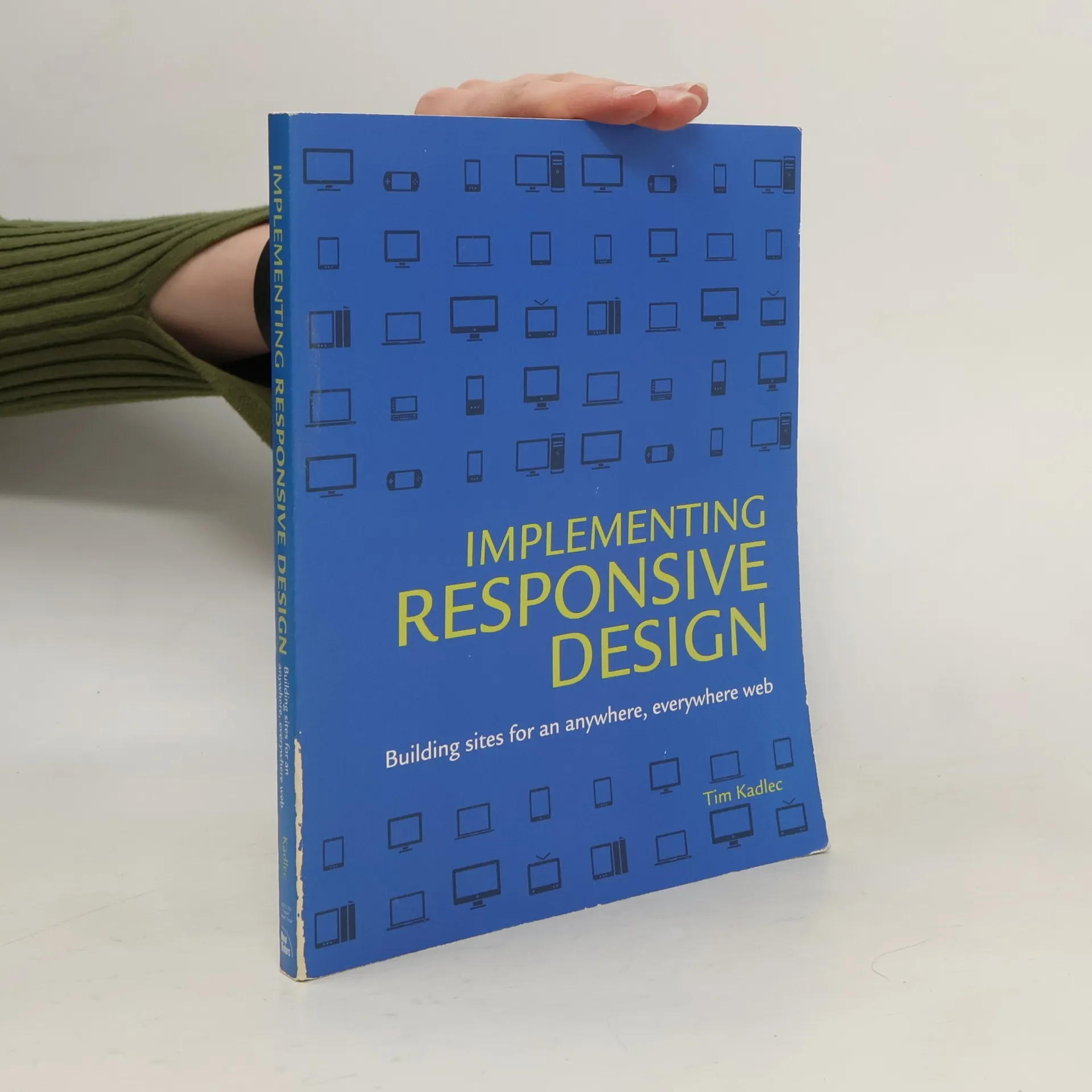
Implementing responsive design: Building sites for an anywhere, everywhere web, Tim Kadlec
- Idioma

- Publicado en
- 2013
- product-detail.submit-box.info.binding
- (Tapa dura)
Métodos de pago
Nos falta tu reseña aquí
- Título
- Implementing responsive design: Building sites for an anywhere, everywhere web
- Idioma
- Inglés
- Autores
- Tim Kadlec
- Editorial
- New Riders
- Publicado en
- 2013
- Formato
- Tapa dura
- Páginas
- 271
- ISBN10
- 0321821688
- ISBN13
- 9780321821683
- Serie
- Etiquetas
- No ficción, Arte / Cultura, Tecnología & Ingeniería, Guías y Manuales, Ordenadores & Internet, Tecnología, Diseño
- Calificación
- 3,95 de 5
- Descripción
- New devices and platforms emerge daily. Browsers iterate at a remarkable pace. Faced with this volatile landscape we can either struggle for control or we can embrace the inherent flexibility of the web. Responsive design is not just another technique-it is the beginning of the maturation of a medium and a fundamental shift in the way we think about the web. Implementing Responsive Design is a practical examination of how this fundamental shift affects the way we design and build our sites. Readers will learn how to: Build responsive sites using a combination of fluid layouts, media queries, and fluid media Adopt a responsive workflow from the very start of a project Enhance content for different devices Use feature-detection and server-side enhancement to provide a richer experience